Ebru Coffee Co.

Year
2024
Scope
Project-based (short-term)
Service
UX Consulting
Methods
Heuristic Evaluation
Competitive Analysis
Tools
Mural
BugHerd
Role
I provided guidance to the business owner and web design team around UX concerns to improve the website’s usability for a cohesive, brand-centered digital experience.
Results
I delivered actionable feedback that improved the site’s usability, accessibility, and alignment with Ebru Coffee Co.’s core values, laying the groundwork for continued refinement as the brand evolves.
The Problem
Ebru Coffee Co. was in the midst of a major brand transition from a neighborhood coffee shop to a wholesale-focused roastery. The company had a strong mission statement, placing a centric focus on the four elements: Coffee, Culture, Community, and Climate. A website redesign was already underway, involving multiple designers, programmers, and agencies collaborating. However, with so many moving parts, the process became overwhelming for the business owner. Without a clear UX strategy to unify the work, the site risked becoming a patchwork of ideas without a cohesive experience.
The business owner faced confusion in navigating technical design feedback, understanding user flow decisions, and aligning the evolving sites UX with the company’s rebrand. My services were brought in to provide an objective, user-centered perspective, offering input across stakeholders, clarifying user priorities, and ensuring the site’s structure, visual identity, and messaging supported the synergy between brand identity and the user experience.
The Process
I collaborated in person and virtually with the business owner, web designers, and stakeholders via email and BugHerd.com to maintain consistent communication. Recommendations were shared as deliverables were received, ensuring timely feedback. Throughout my evaluation, I focused on the synergy between brand and user, considering the complexities of both local and global audiences, what actions users would aim to accomplish, the optimal placement for those actions, and how they aligned with user expectations. The brand’s core mission remained central to the redesign, guiding my perspective on how users would experience the brand while completing key actions.
Research & Discovery
I began by meeting with the business owner to understand his project concerns and how a UX perspective could add value. I then conducted an evidence-based review of both the current site and the in-progress wireframes.
Reviewed existing wireframes and sitemap to identify structural issues and misalignment with user mental models
Conducted a heuristic evaluation to surface usability, accessibility, and interaction design gaps
Information was provided in clear, accessible language suitable for stakeholders of all technical backgrounds
Researched competitor e-commerce sites to identify key features and user expectations relevant to the business’s roastery shift
Heuristic EvaluationCollaboration & Education
Understanding my role was to translate design language, I broke down terms into digestible parts for the business owner. I stayed in contact while sending deliverables to the team, ensuring my recommendations were clear and actionable.
Translated technical design concepts into accessible language, empowering the business owner to make informed design decisions
Explained key UX principles to build confidence in contributing to the design process
Aligned recommendations with the owner’s vision, emphasizing Ebru’s core values, while ensuring they supported user needs
Learned about target user functions from both local and worldwide B2C audiences
Design Input & Refinement
I offered actionable feedback across low-fidelity to high-fidelity stages to improve information architecture, refining the sitemap to better reflect business goals.
Applied key heuristic principles aligned with user mental models, focusing on intuitive navigation and system clarity, to help users understand their actions and increase the likelihood of achieving both user needs and business objectives.
Emphasized core value points such as “Community” by focusing on streamlining communication between customers and the business
Provided input to standardized interaction design elements, including button sizing, dropdown usability, and hover elements for clarity
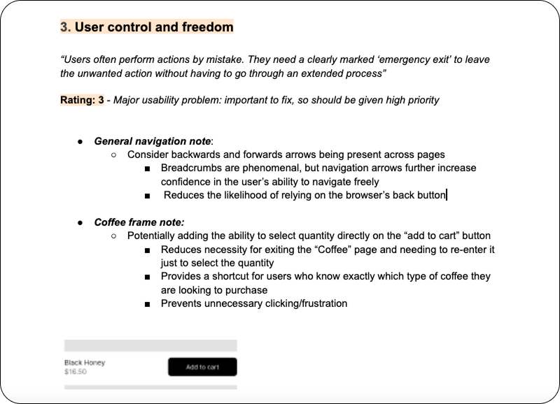
Recommended element improvements from the initial heuristic evaluation to reduce cognitive load and support task completion, including system status indicators like progressive loading animations and clear success/error messaging
Provided inclusive user input into cross-cultural language considerations and color-blind accessibility
Placed focused recommendations on responsive design, emphasizing the “mobile-first” experience

Recommended applying alternate gray hues only to the opened section
Recommended pricing be further spaced from the adjacent activity's "Book" button for error prevention
Recommended including the missing key "Name" and optional "Subject" field in the contact form to correctly identify sender and enhance relationship buildingThe Results
Through my consulting, various navigational and structural elements were enhanced, with a few examples below. The business received documented feedback, which was incorporated into iterations over time. The business owner developed a deeper understanding of visual consistency and best practices, enabling more informed decisions when approving or rejecting design materials. While the project scope was extensive, my early- and mid-stage input helped shape key elements that appear on the live site.
Disclaimer: I was not the designer for this project. My role was solely as a consultant for the website linked below.

Finalized "Contact Us" section
Initial navigation hover without indicator; revised navigation hover with indicator
Initial breadcrumbs not present at the top; revised breadcrumbs present at the topLet’s Connect!
Schedule a free 1:1 virtual coffee chat with me to discuss your UX design needs.
